The choice of colors in interior decoration plays a crucial role in creating atmospheres, conveying emotions, and reflecting the personality of the inhabitants.
The magic of colors goes beyond aesthetics, influencing our mood and impacting how we perceive and interact with the environment around us.
In this article, we will explore the importance of choosing the ideal color palette for your home, providing guidance and inspiration to transform your spaces into truly engaging environments.
The Psychology of Colors: Influencing Emotions
Before delving into specific color palettes, it is essential to understand the psychology of colors and how they influence our emotions. Warm colors, such as red and yellow, tend to convey energy and enthusiasm, while cool colors, like blue and green, are associated with calmness and serenity.
Neutral colors, such as white and gray, provide a sense of balance and versatility.
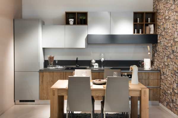
Neutral Palette: Elegance and Versatility
For those seeking a classic and timeless approach, a neutral palette is the perfect choice. Shades of white, beige, gray, and brown create an elegant base that allows for the addition of colorful elements.
Additionally, a neutral palette is versatile, providing the flexibility to change the decor over time without the need for major overhauls.
Monochromatic Palette: Subtle Sophistication
The monochromatic palette involves choosing a single color in different shades and intensities. This creates a visually cohesive and sophisticated aesthetic.
For example, selecting various shades of blue, from light to dark, results in a harmonious and serene environment. This approach is ideal for those seeking a calm and elegant atmosphere.
Complementary Palette: Vibrant Contrast
If you’re ready to be bold and add a touch of drama to your spaces, consider a complementary color palette. Complementary colors are those opposite each other on the color wheel, such as blue and orange or green and red.
This vibrant contrast creates a dynamic and stimulating atmosphere, but it’s important to balance the proportions to avoid excess.
Analogous Palette: Gentle Harmony
The analogous palette involves choosing colors that are next to each other on the color wheel. For example, shades of green, blue, and teal.
This approach results in a gentle and relaxing harmony, perfect for creating cozy environments. Try this palette in resting areas, such as bedrooms and living rooms.
Triadic Palette: Balanced Colors
The triadic palette consists of choosing three colors equally spaced on the color wheel. This balanced approach provides a dynamic and visually appealing color combination.
A well-balanced triadic palette can be applied to different areas of the house, offering a sense of unity and diversity at the same time.
Earthy Tones Palette: Connection with Nature
Earthy tones, such as brown, terracotta, olive green, and sand shades, provide a palette directly connected to nature.
These colors convey a sense of warmth and stability, making them ideal for communal spaces and relaxation areas. Add natural elements like plants and organic materials to enhance this connection.
Pastel Colors Palette: Enchanting Softness
Pastel colors, such as light pink, baby blue, and mint green, offer a soft and enchanting palette. Ideal for children’s rooms or spaces dedicated to relaxation, pastel colors create a serene and delicate atmosphere.
Complement this palette with white or neutral furniture to maintain a sense of lightness.
Vibrant Colors to Stimulate Energy
If you’re looking for vitality and dynamism, consider introducing vibrant colors into your spaces. Red, yellow, and orange are known to stimulate energy and creativity.
Paint a wall in a vibrant shade or add accessories and details in these colors to inject a dose of vitality into living rooms, offices, or work areas.
Tone-on-Tone Elegance
The tone-on-tone color palette offers a sophisticated and elegant approach. Choose a main color and explore different tones and intensities of it.
For example, if you opt for blue, experiment with combining light blue, petrol blue, and navy blue. This technique creates depth and visual interest, providing a luxurious and cohesive aesthetic.
Metallic Colors for Subtle Shine
Add a touch of subtle shine to your home with metallic colors such as gold, silver, and copper. These colors bring a sense of glamour and sophistication.
Consider incorporating metallic elements into fixtures, mirror frames, and decorative objects for an elegant touch that reflects light captivatingly.
The Reassuring Power of Dark Tones
Dark tones, such as graphite, dark green, and burgundy, have the power to create a cozy and enveloping atmosphere. Although often associated with more formal environments, these tones can be used in any space to convey a sense of coziness.
Combine them with strategic lighting elements to prevent the space from feeling too closed in.
The Magic of Details: Accessories and Decorative Objects
Do not underestimate the impact of small details in choosing the color palette. Through accessories and decorative objects, such as cushions, vases, artwork, and rugs, you can incorporate different tones and textures, enriching the visual experience of the spaces.
These elements also offer the flexibility to experiment with temporary colors, following the seasons or your current mood.
Colors in Lighting: Creating Unique Atmospheres
Lighting plays a significant role in how we perceive colors in a space. Consider using dimmable LED bulbs to adjust light intensity and experiment with different shades.
Colored lamps or fixtures with colored details can add a surprising touch to the decor, allowing you to create unique atmospheres for different occasions.
The Transformative Power of Furniture Painting
Revitalize your existing furniture through painting. Choose a color palette that complements the overall decor of the room and breathe new life into tables, chairs, shelves, and other elements.
Painting furniture is an affordable and creative way to incorporate colors into your home, adding personality and a unique touch to your furniture.
Colors in Nature: Inspiration for Organic Palettes
Find inspiration in nature when creating organic color palettes. Explore shades of green, brown, sky blue, and soft yellow to create a sense of harmony with the natural world.
These palettes not only provide a relaxing aesthetic but also connect your home to the outdoor environment, creating a welcoming atmosphere.
Colors that Facilitate Concentration and Relaxation
Consider the function of each space when choosing the color palette. For work or study areas, soft shades of blue and green are known to promote concentration.
For relaxation areas such as bedrooms and living rooms, soft shades of pink, lilac, and gray can create a calming atmosphere conducive to rest.
Timelessness of Classic Colors
Certain colors never go out of style and are timeless in decoration. White, black, gray, and brown are examples of classic colors that can serve as a base for any color palette.
These neutral colors offer a versatile canvas to experiment with more vibrant decorative elements and can be adapted to different styles over time.
Sensorial Experiences with Textured Colors
In addition to choosing colors, consider the texture of materials used in decoration. Texture can influence how we perceive colors and add a tactile dimension to the environment.
Experiment with textured fabrics, plush rugs, or ceramic decorative elements to create a richer sensorial experience.
Keep reading our articles:
Remarkable Advantages of Compact Dwellings
The Importance of Visual Harmony: Cohesion Between Spaces
When working with different color palettes in different areas of the house, it is essential to ensure visual harmony. Choose a transition color that appears in both spaces to create a cohesive connection.
This can be achieved through elements such as rugs, curtains, or even decorative details that share the same hue.
Conclusion:
When choosing the color palette for your home, consider not only trends but also your personal preferences and the emotional impact you want to achieve.
Experiment with color samples on the walls before making final decisions and consider natural and artificial lighting when evaluating how colors behave at different times of the day.
Remember, the magic of colors lies in their ability to transform spaces and create a unique atmosphere that reflects who you are and how you want to feel in your home.